
 Optimizing eCommerce Businesses since 2016
A meaningful FAQ Section is one of the most important components of a successful eCommerce website.
Every FAQ should contain relevant, user-focused information that helps solve a problem or answer a question. In the best-case scenarios, we have data to support the questions being asked, allowing for more specific topic clusters to group users as they go further down the support section. For tips on how to start an eCommerce FAQ section, click here.
In this article, we are investigating some great Frequently Asked Questions sections from popular public websites that have stellar user experiences. Don’t know what user experience is? Discover it here.
Design & UX Comparisons: FAQ Sections for eCommerce
Considerations for customer experience are paramount when designing the official FAQ section of an eCommerce website. Challenges such as AODA Compliance create new technical debts, often inherited from old hosting setups, inefficient code, and inaccessible FAQ architecture. Google can even interpret schema.org data that is specifically designed for Frequently Asked Questions sections, displaying them from the SERP without having to visit the online store. This is why FAQ sections require a great user experience, you are competing with your own content against Google’s UX.
It is estimated that by 2022, voice search shopping is expected to reach USD 40 billion with more than 30% of US internet users using voice-based assistance to check product information. Understanding this, it is important to leverage voice search to improve the accessibility of your FAQ section. By utilizing this organic traffic there will be more opportunity for conversions — so having a clean UX in the FAQ section is important.
One of the most important questions about the FAQ section is where to include it. Including it on Product pages or having a dedicated section are both appropriate strategies. Approaching which questions to include based on their generality, customer service & shipping policies, or product customization. The seller or brand should have contact information including store hours, locations, etc. This includes what payment methods are accepted and which ones are not, how the products are delivered and what the process is like after ordering a product.
While some FAQ sections opt for a purely text-based experience, we believe that design is equally if not more important. By having a well-defined UX, you can increase conversions and the amount of branded traffic that you control. Having the ability to answer a question before someone else does about your product can be the difference between a customer or losing to a competitor.
UX & Design Analysis for Popular Frequently Asked Pages
- Apple Search Ads Help Section UX
- Google AdWords Help Section UX
- Amazon Ads Help Section UX
- Microsoft Search Ads Help Section UX
- TikTok Ads Help Section UX
- Snapchat Ads Help Section UX
- Twitter Ads Help Section UX
- Meta Ads Help Section UX
Ecommerce sales in the U.S. alone gross $130 billion per quarter, while in Canada eCommerce sales have grown 18 percent during the pandemic. While no one knows exactly what the future holds, the trend indicates that the growth of online products and services is not slowing down any time soon.
When building an eCommerce business you will definitely need technical SEO. Beyond that, expect to design some unique product offering or experience, great content to support that experience, site architecture to easily navigate the elements of that experience, and product mapping to convert users into customers.
Apple Search Ads UX/Help Section SEO
One of the newest pages in our sample, the Apple Search Ads UX is a great example of technical SEO at work. Not only do the UX and responsiveness on mobile devices perform absolutely on point, but the architecture of each section also has a logical arrangement that is easy for crawlers to identify what the content is about. Apple Search Ads dominates their space in organic search with plenty of keywords and FAQ sections to satisfy user intent.
Website: searchads.apple.com/
Organic Keywords: 4.1K
Top Keywords: app store ads, apple search, apple advertising, search ads
Traffic Value: $27,612
Date Analyzed: June, 2022

Apple FAQ Technical SEO Architecture
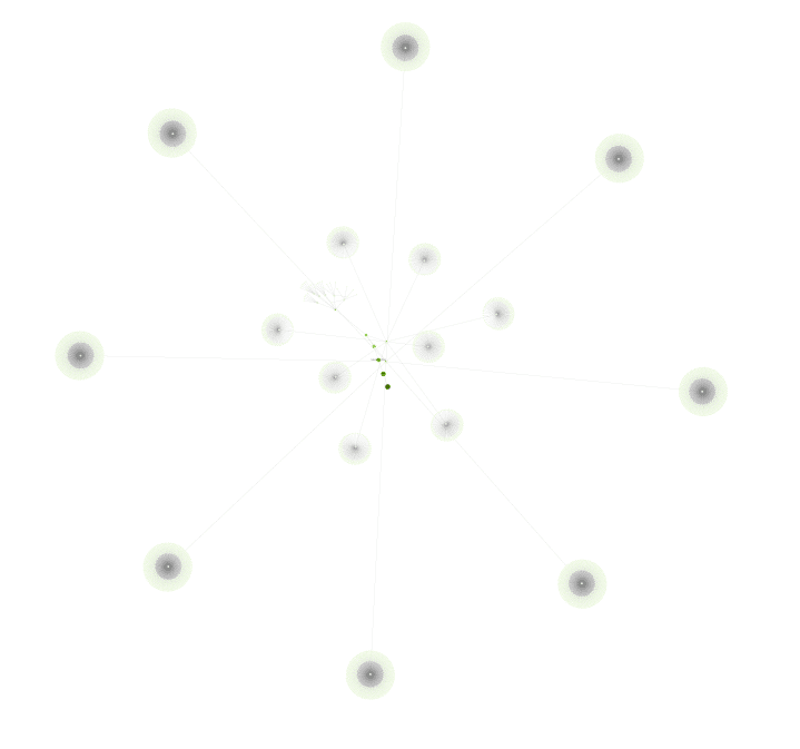
Lets investigate the technical architecture of Apple Search Ads, starting with the depth of the pages.

Some UX/ Accessibility benefits include:
- The website has over 98% Indexation
- Logical Architecture for Question Silos
- Efficient URLs, Appropriate depth
Site Architecture Analysis – Apple Search Ads

Topic Silos
Organized by questions, topic clusters, and relevant sub-topics. This is an example of a great

Site Architecture
A clean linking structure makes it easier for search engines to categorize the content. Apple’s SEO team has done an excellent job of siloing its content into relevant clusters.
Apple FAQ User Experience
Relevant FAQ Details when Creating Campaigns
Organized by questions, topic clusters, and relevant sub-topics. This is an excellent example of effective interlinking for informational FAQ sections.
Responsive Pages with Clear Paths
A clean linking structure makes it easier for search engines to categorize the content. Apple’s SEO team has done an excellent job of siloing its content into relevant clusters.

As a result of these features, the Apple Search Ads ranks for all of the important keywords related to questions in the space. When someone searches for help, there is a good chance that Apple’s organic results will be the one that provides it.
Overall, we give Apple an 8/10 for their FAQ Section. Some minor Technical SEO implementations could take it to 10/10.
Google AdWords UX/Help Section
We expected Google to have the best Help section based on how long they have been in the search ads business. Surprisingly, their help section is not that user-friendly with a shallow site architecture that makes us wonder if SEOs at Google even exist. Let’s dive a bit deeper into the setup here.
Website: support.google.com/google-ads/
Organic Keywords: 438K
Top Keywords: app store ads, apple search, apple advertising, search ads
Traffic Value: $771,300
Date Analyzed: June, 2022

Google Ads FAQ Technical SEO Architecture
Let’s investigate the technical architecture of Google Ads, starting with the depth of the pages.

Some UX/Accessibility problems include:
- 48% of the help website consists of 301 Redirects
- Question & Answer Silo URLs not clearly defined, flat site layout
- Inefficient URLs, lack of architecture
Site Architecture Analysis – Google Ads

Topic Silos
Organized by patchy redirection clusters and wasted content. With over 48% of the site consisting of redirects, it’s difficult to imagine calling this a good user experience.

Site Architecture
All content is split between “TOPIC” and “ANSWER” sub folders. This appears to be an archaic style of organizing information in a flat structure. Does not benefit from friendly URLs.
Google FAQ User Experience
Search Centric, If You Don’t Know We Don’t Know Either
Organized by query boxes, most of Google Ads is comprised of user-generated content. If you want to find an official answer to something, there is a good chance multiple domains or answers will be provided in the SERP, which is not a good experience.

Responsive Pages with Ugly Design
The responsive features for Google Ads are much fine but UX lacks personality. A little too much white space and no intuitive resolution. Google has also opted for user-generated content, questions, and support methods that may not be the best suited for what someone is looking for.

Google Ads FAQ Section needs an SEO to help include sub-topics or related content that would be helpful for the user.
Overall, we give Google Search Ads 4/10 for their FAQ Section. Some major Technical SEO implementations including a Migration Plan could improve UX, saving new users a lot of time and hassle trying to find answers.
Amazon for Business UX/Help Section
Digging into the support channels for eCommerce on Amazon, we found their FAQ platform felt clean and better designed than Google. While they did not rank for as many keywords, they ranked for the important ones that matter to customers. Sometimes the demand for a product can increase the number of keywords it ranks for by creating new questions that customers search for.
Website: https://advertising.amazon.com/resources/faq
Organic Keywords: 105
Top Keywords: amazon advertising business, react grocers replace screens playing ads, advertising questions, amazon ad system
Traffic Value: $39
Date Analyzed: June, 2022

Amazon Ads FAQ Technical SEO Architecture
Let’s investigate the technical architecture of Amazon Ad FAQ, starting with the depth of the pages.
Some UX/Accessibility observations include:
- There are relatively few Technical SEO problems
- Question & Answer Silo URLs are not defined as friendly URLs, Appropriate depth
- Internationalization features present and ranking across multiple Countries

Site Architecture Analysis – Amazon Ads

Topic Silos
Organized by poorly defined content clusters and wasted site architecture opportunity. With the proper design, Amazon could fix these easily. The lack of optimization is reflected by the number of keywords they rank for, as well as the demand for their service.

Site Architecture
All content is split between “RESOURCES” and “SOLUTIONS” sub folders. This is an older, less clear architecture that likely is holding back growth for organic search.
Amazon FAQ User Experience
Easy to Navigate but COVID-19 Centric
Organized by topic clusters, Amazon’s Business Ad FAQ section is simple. Looking to find an official answer to something COVID-related, the FAQ seems to have what you need. While most topics are thin, some optimized questions for urgent issues.
Responsive Pages with Ugly Design
The design is not very interesting, mostly text that populates and some answers to important questions are just a sentence long. As demand increases for FAQs on Amazon, we expect this section to be optimized.

Overall, we give Amazon Ads for Business 5/10 for a decent FAQ Section. Some major Content Marketing strategies mixed with design improvements to UX could earn more keywords in the SERP, saving new users a lot of time and hassle trying to find answers. Right now things feel a bit disjointed for someone who is trying to onboard into the Ads platform.


Microsoft Ads UX/Help Section
Microsoft is one of the largest competitors to Google and carries its own search engine marketing platform, Bing Ads, which has matured to become a viable platform for search marketing. Looking at the UX of their FAQ section and the keywords it ranks for, we could see a correlation between time since inception and the amount of keywords ranking. Microsoft may have a lower “traffic value”, but they certainly know how to own their brand by optimizing for an intent-focused customer support experience.
Website: https://help.ads.microsoft.com/
Organic Keywords: 28.8K
Top Keywords: bing ads, bing merchant center, microsoft ads, microsoft ads file
Traffic Value: $15,634
Date Analyzed: June, 2022

Microsoft Ads FAQ Technical SEO Architecture
Let’s investigate the technical architecture of Microsoft Ads, starting with the depth of the pages.

Some UX/Accessibility features include:
- Technical architecture similar to larger sites (Amazon, Google)
- Question & Answer Silo URLs not clearly defined, flat site layout
- Inefficient URLs, lack of architecture
Site Architecture Analysis – Microsoft Ads
Topic Silos
Microsoft help article URLs follow numerical or arbitrary naming systems, it’s difficult to imagine calling this a good user experience.

Site Architecture
Flat and not much to it, the Microsoft architecture is designed with SEO as an afterthought.
Microsoft FAQ User Experience
Not Afraid to be Fun, The Other Google
One of the few FAQ sections that featured graphics, the Microsoft Ads section does not stray from having fun when communicating their brand of search engine advertisements.

Responsive Pages with Mostly Good Content
Some sections felt empty or unfinished. Thin content and a search-centric support model are only as helpful as the person using the systems. It is better to provide a pathway to help someone discover a solution rather than hoping they can search and find it. That’s what the search engine is for!.

Overall, we give Microsoft Search Ads 4/10 for their FAQ Section. Less search-centric, better topic silo organization, and some related question buttons could improve UX, saving new users a lot of time and hassle trying to find answers.


TikTok Ads UX/Help Section
TikTok is one of those platforms that people can spend money on but never really understand the return on investment. Digging into the FAQ support section we were horrified to find that not only was the content disorganized and hard to find, but the website as a whole was not responsive or mobile-friendly. For a company that is using mobile-based apps to sell ads and grow users, it is concerning to see such little attention to detail on its website.
Website: ads.tiktok.com/help/
Organic Keywords: 5.8K
Top Keywords: tiktok ios 14, tiktok ad specs, tiktok help center, tiktok spark adage
Traffic Value: $247
Date Analyzed: June, 2022

TikTok Ads FAQ Technical SEO Architecture
Let’s investigate the technical architecture of TikTok Ads, starting with the depth of the pages.

Some UX/Accessibility problems include:
- The website is not mobile-friendly!
- Question & Answer Silo URLs not clearly defined, flat site layout
- Inefficient URLs, lack of architecture
Site Architecture Analysis – TikTok Ads

Topic Silos
Dynamically generated content that is not easy to crawl, resulting in poor indexation from Google.

Site Architecture
Content is not clearly labeled, or easy to locate.
TikTok FAQ User Experience
Surprisingly Not Mobile Friendly
One of the most popular mobile apps does not seem to have its mobile site together. This is pretty surprising given that TikTok is in the mobile app niche. I wonder why this is?

Fails AODA, Technical Checks
The pages cut off when they should be responsive. This is probably one of the worst user experiences on this list and would definitely fail AODA checks.

TikTok Ads FAQ Section needs an SEO to help include sub-topics or related content that would be helpful for the user.
Overall, we give TikTok Ads 1/10 for their FAQ Section, mostly because the design is not mobile-friendly. Some major Technical SEO implementations including a Migration Plan could dramatically improve UX. Fix your site!

Snapchat Ads UX/Help Section
Snapchat is another platform that brands dump money into but have a difficult time understanding the return on investment. Digging into the FAQ support section, the responsive site was helpful when providing mobile-based content. There was not a lot of diversity for the keywords in this section, suggesting that Snap could do a better job of brand awareness for their ads department.
Website: https://businesshelp.snapchat.com/?language=en_US
Organic Keywords: 97
Top Keywords: snapchat business, ads.snapchat.com, snapchat busines, snapchat bussines
Traffic Value: $12
Date Analyzed: June, 2022

Snapchat Ads FAQ Technical SEO Architecture
Let’s investigate the technical architecture of Snap Ads, starting with the depth of the pages.

Some UX/Accessibility problems include:
- Question & Answer Silo URLs not clearly defined, flat site layout
- Inefficient URLs, lack of architecture
Site Architecture Analysis – Snapchat Ads

Topic Silos
There are large clusters of broken pages, and a completely new cluster of what seems to be their replacements. Did Snap update its FAQ architecture lately? A question for another case study.

Site Architecture
All content is within the article, /s/ nomenclature.
Snapchat FAQ User Experience
Well-Spaced, Organized, Search-Centric Layout
The Business Help Center is a responsive FAQ section for Snapchat Ads that is an informative tool that ranks for organic keywords related to customer support questions for Ads.

Responsive Pages & Brand Identity
The responsive features for Snap Ads are on brand, attempting to bucket support methods. The mobile-friendly UX is definitely better than its competitor, TikTok. Overall, Snap Ads have a pretty good user experience.

Taking into consideration Snap has never paid for traffic on Google but has still managed to stay relevant, we give Snapchat Ads 3/10 for their FAQ Section.
Twitter Ads UX/Help Section
Advertising Policies are critical for operating eCommerce websites on Twitter. Depending on the audience, there are considerations for how Twitter displays data. Twitter did not have any paid search data available, which makes sense since they have their own ad network they want to sell. While the forensic analysis suggested a low traffic value, the keywords related to Twitter Ads Support are optimized to help users onboard into Twitter Ads.
Website: https://business.twitter.com/en/help.html
Organic Keywords: 192
Top Keywords: help twitter, twitter advertising help, twitter ads contact, twitter ad help, help center twitter
Traffic Value: $642
Date Analyzed: June, 2022

Twitter Ads FAQ Technical SEO Architecture
Let’s investigate the technical architecture of Twitter Ads, starting with the depth of the pages.

Site Architecture Analysis – Twitter Ads

Topic Silos
Surprisingly few broken links within Twitter’s FAQ crawl diagram, suggesting that they take SEO seriously and are probably going to read this post eventually. We love Twitter!

Site Architecture
The focus here is internationalization, which makes sense on a platform like Twitter. When people from all around the world are looking for help, you better have some HREFLANG configurations ready to serve them. Twitter has done this right!
Twitter FAQ User Experience
Cool But Not Always Intentful
The content for Twitter Ad’s FAQ is excellent! We would just organize it a bit differently to optimize for the intent of someone learning about the platform vs. fixing ongoing issues, troubleshooting, etc.

Responsive Pages Consistent Branding
The responsive features for Twitters Ads are great. They clearly have taken AODA seriously and want the most accessible experience for their users. Elon, are you reading this? Twitter offers one of the best UX for FAQ pages.

Overall, we give Twitter Ads 6/10 for their FAQ Section. Intentful user experiences could improve topic silos, saving new users a lot of hassle trying to find answers between content that is for a veteran or experienced users and vice versa. Twitter provides a transparent lens into how the company collects and tracks user data.


Meta Ads UX/Help Section
The choice of questions for any FAQ section will evolve with data and engagement. As companies evolve, so must the content that assists the users interacting with that company. Using organic keyword research we can identify opportunities to help reduce the support load for new customers. Meta is one of those companies that has rebranded (previously Facebook, The Facebook) and forced itself into an awkward architecture of redirects, old content, and migration challenges. With the highest “traffic value” on this list, Meta has the most to lose by not having a responsive, helpful UX for their FAQ support section.
Website: https://www.facebook.com/business/help/
Organic Keywords: 333K
Top Keywords: facebook business page, facebook chat support, facebook business manager login, facebook name change
Traffic Value: $1,191,357
Date Analyzed: June, 2022

Meta Ads FAQ Technical SEO Architecture
Let’s investigate the technical architecture of Meta/Facebook Ads, starting with the depth of the pages.

Some UX/Accessibility problems include:
- A large portion of the help website consists of broken redirects
- Question & Answer Silo URLs not clearly defined, flat site layout
- Inefficient URLs, lack of architecture, SEO maintenance needed
Site Architecture Analysis – Meta Ads

Topic Silos
Organized by patchy redirection clusters and wasted content. With over 40% of the site consisting of redirects, it’s difficult to imagine calling this a good user experience.

Site Architecture
All content is hidden behind id syntaxes, without friendly URLs. Since Facebook is so big, they don’t need to adapt to a modern, more usable URL architecture. But one day they might.
Meta FAQ User Experience
Search Centric, If You Don’t Know We Don’t Know Either
Meta Ads feel like a newspaper buy and sale fold, full of chunky text that is splattered all over your mobile device. Clicking between buttons is difficult, and surprisingly confusing to find the fundamental links for running ads.

Responsive Pages with Ugly Design
The responsive features for Meta Ads are standard but UX lacks personality. There is an overwhelming number of links on one screen.

Overall, we give Meta Search Ads 4/10 for their FAQ Section. Some major Technical SEO implementations including a Migration Plan could improve UX, saving new users a lot of time and hassle trying to find answers.


Conclusion
FAQ sections that opt for a purely text-based experience will perform well organically, but in order to achieve growth, you need to improve UX & site architecture. This will help increase conversions and control over the PR for your brand. Comparing the top Search Ad companies, providing relevant buckets of support content is key, but how that content is organized is even more important.
Case Study: FAQ & UX Implications on SEO
Discussion
A simple text-based experience can outperform a prettier, less responsive website when it comes to FAQ sections.
This makes sense because graphics are less important than the information and how it is organized. Interestingly enough, we noticed the cleaner the design, the more keywords the page ranked for– keeping in mind this was a categorical analysis. To further investigate this experiment, we would have to revisit web pages on an individual basis and rank their UX, Content, Link Profile, etc. Having the ability to compare multiple competitor URLs can make the difference between content investment, hosting improvements or technical SEO adjustments. The winner for FAQ sections is clearly Apple with a succinct, user-focused experience that feels like it is guessing what you want before you even get there.
This analysis was performed in June, 2022. Some of the information may be outdated by the time you read this, but the considerations for search will still be relevant. How long will it take before TikTok is mobile-friendly? Hopefully, someone can guide them in the right direction.
Some SEO research tools we used to perform this analysis were
- ScreamingFrog, one of the applications used for Technical SEO
- Sitebulb, a helpful auditing tool that is also helpful for data visualization
- AHRefs, is the preferred T-SEO SaaS tool for research, auditing & forensics.
Have questions about this study or something you want us to investigate? Contact our team.